Communicating personality, style and expertise
The brief
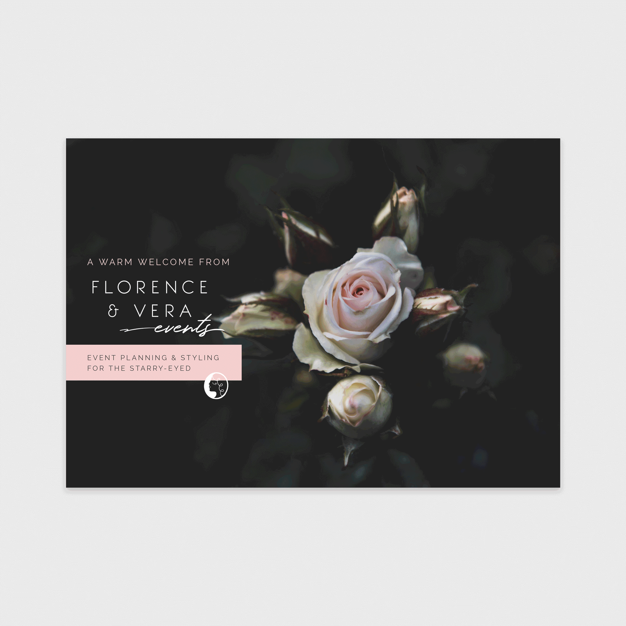
Buttercrumble created the brand suite for Florence & Vera to help create its professional image and expand company visibility for future clients.
Florence & Vera Events is an events stylist and planner. The team can find your venue, help organise your event, liaise and collaborate with suppliers and supply many different props too.
The stylish sans serif typeface has been combined with a handwritten script to reflect the expert, tailored and personal service Florence & Vera provides. The logo should always be placed thoughtfully with generous spacing to sustain and convey a clear and professional image.


The logo can be used flexibly across a range of marketing material. The logo blends influences from the late 19th century with mid-century design. This is to reflect the beautifully curated selection of antique and vintage props Florence & Vera provides. The cameo gives a subtle nod to the brand’s story.
Colour
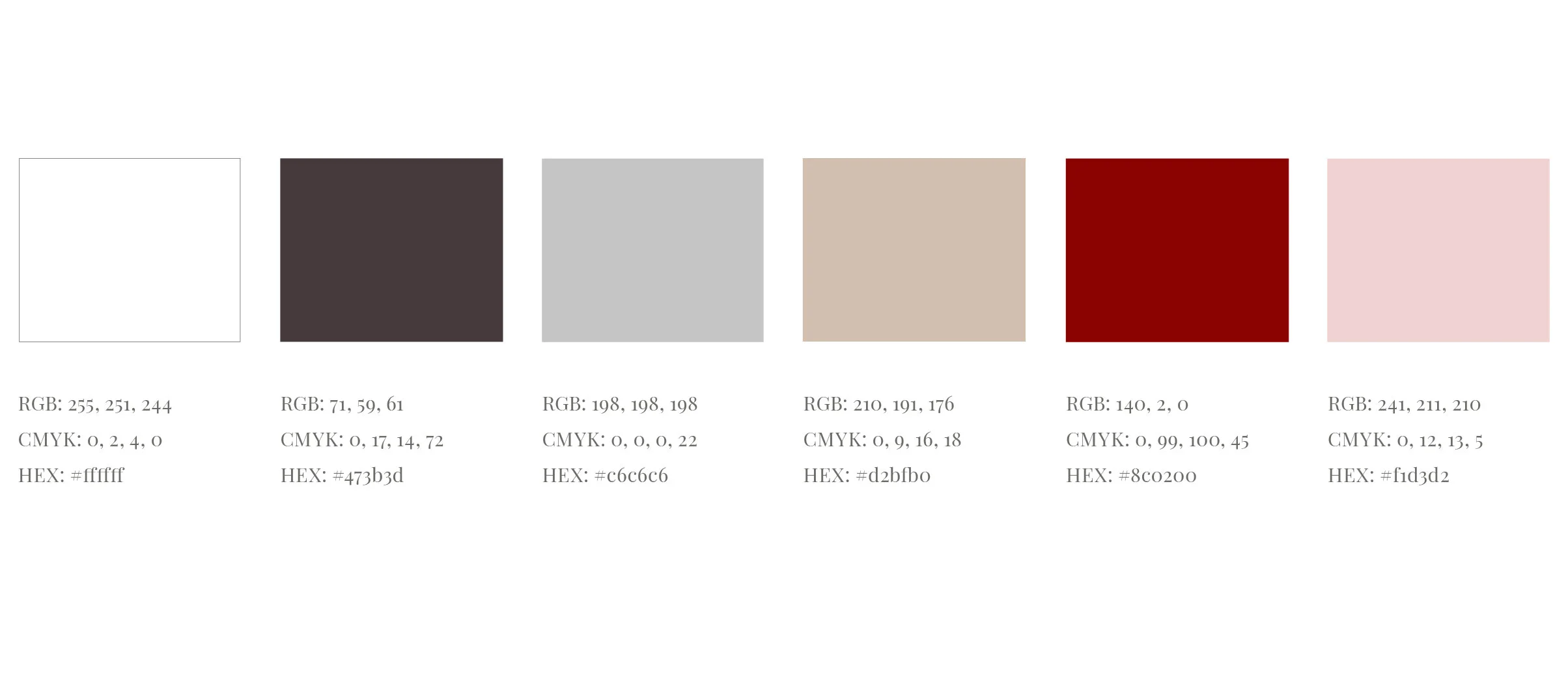
The colour scheme expresses Florence & Vera’s ethos; it’s romantic, sumptuous and fun. White and off-white should be used generously when designing to convey freshness and modernity. The secondary colours can be used to highlight information. They introduce energy and warmth for the occasions when monochrome is too stark. Colours should be used consistently across all brand collateral.

Typography
The typography reflects Florence & Vera’s harmonious blend of traditions and modernity. Raleway should be used as a header type, to highlight key information. Playfair Display is most suitable for larger bodies of copy. Both fonts are widely available for web and print usage.