Aligning an organic skincare brand with heartfelt values
The brief
Buttercrumble rebranded Myroo Skincare to help them become more aligned with their brand values and focus. This included: brand strategy, customer profiling, corporate identity and a packaging redesign. The new branding and packaging has helped Myroo to secure new stockists and scale past the start-up stage.
"We are the only organic skincare brand that places kindness at the heart of everything we do. Myroo is for natural beauties who want to kick-start the gentle revolution to feel nurtured, calm and strong".


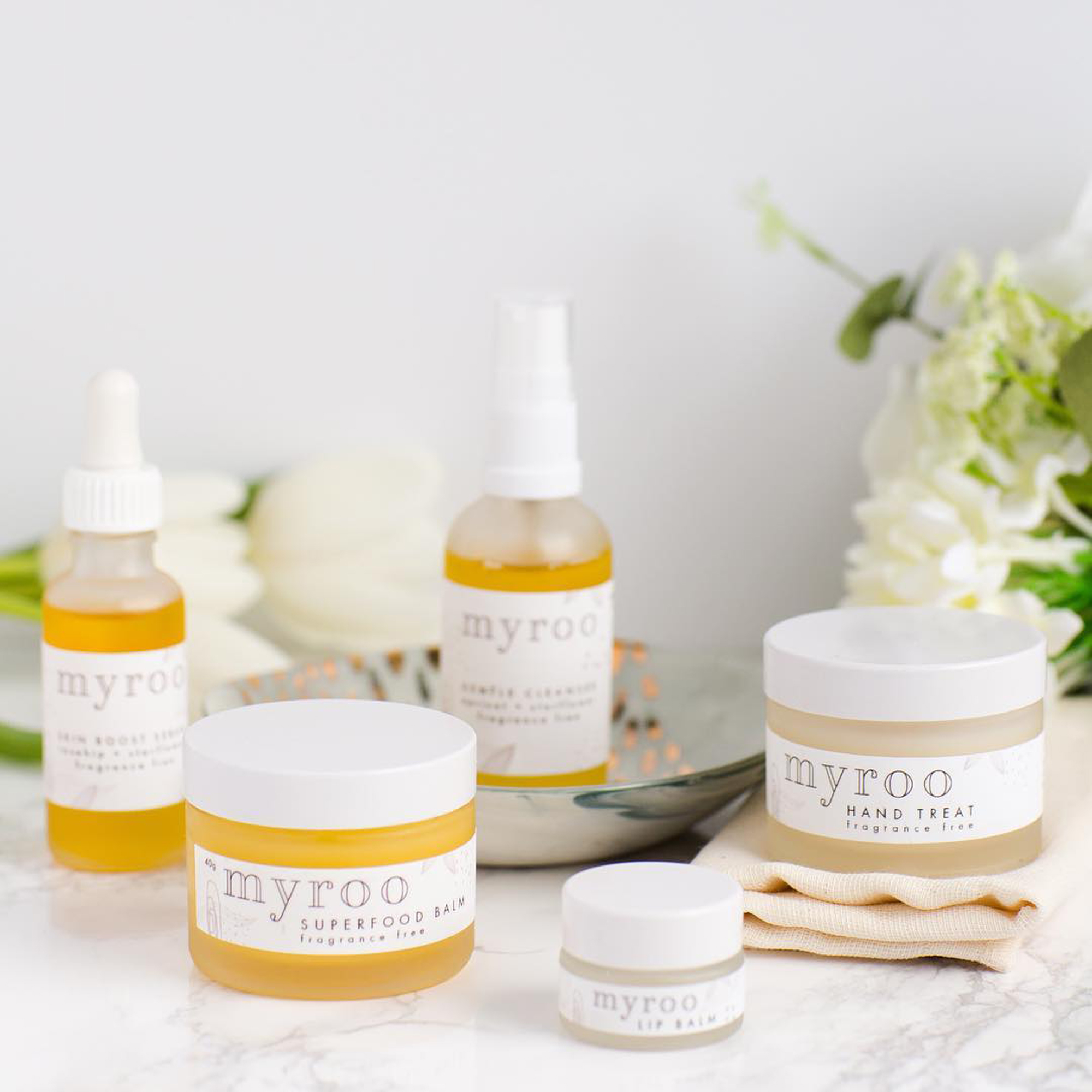
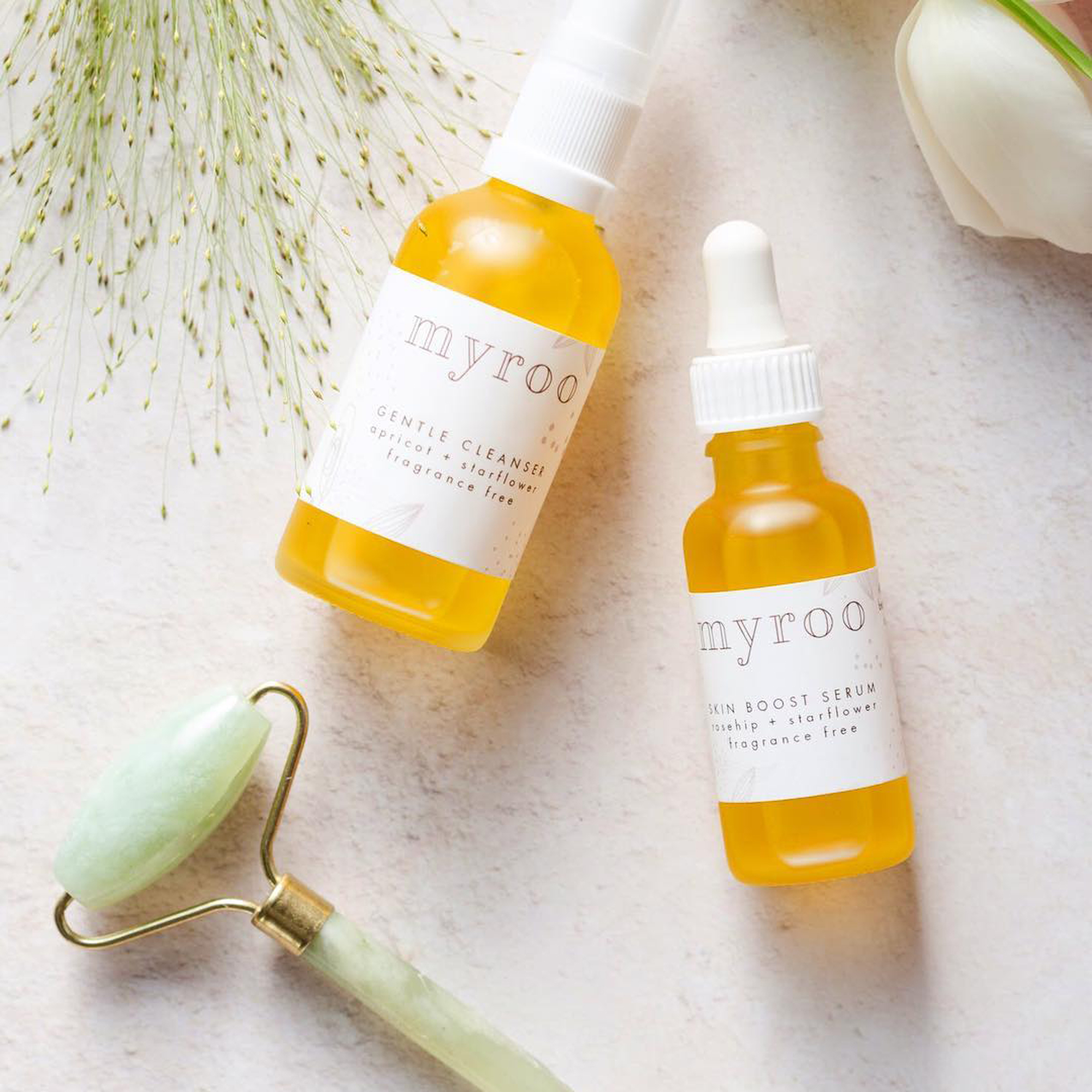
Myroo Skincare has a contemporary logo based on the fashionable typeface, Didot. The simplicity and airiness of the logo reflects Myroo’s clean and organic brand values. The logo can be placed on an array of backgrounds which express their brand values of kindness and purity.
As part of the rebrand, Myroo Skincare received an animated ident to express their message in an engaging way. Videos are the most popular form of content on social media, so the ident can be shared as it is or alongside any video content they produce.


Colour
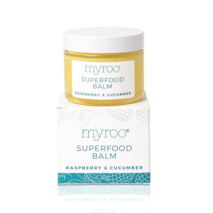
The colour scheme expresses Myroo’s ethos; it’s warm, strong and positive. White has been used generously across the designs to express the clean and natural nature of the product with pops of colour to create a personality that is kind and not clinical or overly scientific. The colours each represent different Myroo product ranges.


Typography
Myroo Skincare's branding and packaging features fonts, Didot and Futura. Didot is a French serif typeface with a classic and elegant feel which offers a timeless aesthetic. Futura is a geometric sans-serif typeface which conveys modernity and cleanliness through its regular shapes and even weight.


Each pattern represents one of Myroo Skincare's product ranges: Back to Calm, Night, Relax, Treat and Repair, Uplift and Super Sensitive (Fragrance Free). The glyphs within the patterns are inspired by plant cells and the works of mid-century designer, Lucienne Day who abstracted natural forms to create unique images. The natural forms reflect the ingredients within Myroo's products.


Old Packaging

New Packaging
The results
Buttercrumble rebranded Myroo Skincare to align the company with its brand values and focus. The new packaging stands out in a saturated marketplace and has helped the brand to secure new stockists such as John Lewis & Partners and Anthropologie. The packaging received great feedback from bloggers and influencers.
“This is a brand with a unique plant-based selling point – it also helps that the packaging is beyond gorgeous and basically made for Instagram.”

