Design Success for Morley Arts Festival
Without design, an organisation can be easily missed and forgotten. This would be catastrophic, especially for a festival.
Earlier this year, Buttercrumble was delighted to be commissioned by Morley Arts Festival. We partnered to create a visual identity they could be truly proud of. The local people of Morley loved it too! Here’s how we got on with the project…
The Brand
Morley Arts Festival is a charity organisation based in South Leeds. The festival was established 15-years ago, and in 2015 they expanded their focus from solely literature to celebrating everything arts and culture! As an organisation which is strongly rooted in its community, they nurture their audience by creating a wide range of arts activities, and cultural events throughout the year.
The Brief
Creating a new visual identity was an important step in Morley Arts Festival’s journey to rebrand, as this could be carried across all of their print and digital designs. Plus, it was important that their logo embodied their community spirit by being accessible and inclusive.
For us, at Buttercrumble, it was exciting to be able to partner with an organisation which ignites such a passion for the arts! Whether this be visual art, music, dance, film, literature, or heritage.
The Design Process
The team at Morley Arts Festival had already begun visioning before they joined forces with Buttercrumble, so this meant that they had a strong idea and purpose in mind. We love collaborating, and the project had a strong element of co-creation throughout as we worked closely with the team to listen to feedback and develop their new brand identity.

Above: Initial sketches to convey Buttercrumble’s ideas for Morley Arts Festival.

Above: The final word mark for Morley Arts Festival.
The Final Design
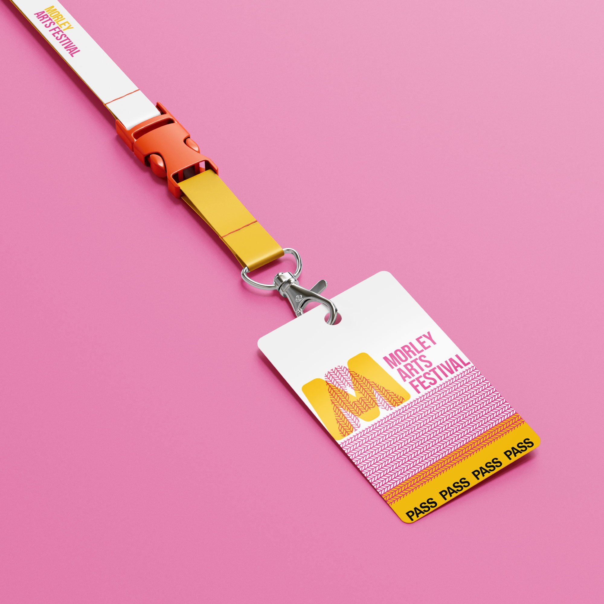
We used layering and staggered placement of text to create a sense of modernity, yet we also wanted to reference the rich textile history of Morley by implementing a textile pattern. As a result, the logo honoured the past whilst looking to the future.
Take a look below to see the outcome! Can you spot the wool texture on the “A”?

The Impact
The Morley Arts Festival Weekender (which took place in September 2021) saw an amazing 3,200 people engaging with the programme! Lots of new faces appeared this year — who wouldn’t normally have attended — which is fantastic.
“The board were very happy with its success and impact on the local community [...] We received a lot of anecdotal feedback including such positive praise for our new branding! We still love the logo and feel it helps us stand out from the rest.”
We were delighted to hear such wonderful feedback from Morley Arts Festival, and to hear that their new brand identity has been well received by their community, too!
We hope you enjoyed this edition of the Buttercrumble Blog. If you have any design conundrums, please do reach out to us. Alternatively, sign up to our newsletter below to never miss a beat.