Design Principles: Typesetting
What is typesetting?
Just one look through a spread and you are completely aware of the content! Have you ever wondered why different texts are easier to understand? This is what good typesetting is. Letters are legible, titles are visible and the page looks neat and clean.
What does typesetting consist of?
Fonts
Serif or sans serif? font or typeface? We will briefly discuss the difference later.Leading
The space between the verses.Kerning
The space between the letters.Hyphenation
Shall we break the words in two verses?Grid
Margins, columns, rows and breaks.…and More!
Alignment and rotation, use of colour, paragraph styles…
Ah! Before you get confused — what’s the difference between the typesetting and the typography?
Due to the Gutenberg revolution, the use of printing presses caused bigger differences between these concepts. Simply, typography is the design of the letters. Typesetting is the process of setting the type. Easy.
1. Font
As you may have noticed, most books use serif fonts in their paragraphs as it’s far more readable. Sans-serif fonts work well for headings, so it’s often a popular font pairing choice. Remember not to pick more than two to three different fonts though, as it will overwhelm the design.
Top Tip: This website provides many beautiful examples for font pairing ideas.

Left: Serif font. Right: Sans-serif font. Image by Kasia of Buttercrumble
2. Leading
Leading is named after the slugs of lead, traditionally inserted between lines of metal type for printing. It is the space between lines of text.
Leading settings may make reading easier and can alter the mood of the text. Leading should be chosen individually, depending on the font used. After all, some fonts are taller and some are wider.
Remember: the height of the font consists of the letters’ ascenders and descenders. It’s a typography crime when they clash!
Leading. It’s like pouring the milk into your tea. Too little and you will get a strange aftertaste. Too much and you’ll consider whether it’s even tea anymore?
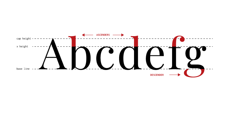
Image by Kasia of Buttercrumble
3. Kerning
Kerning is like leading, but between the letters. It’s just as important and unnoticeable when practised well.
Have you ever wondered why font licenses can be expensive? It’s because the typography’s designer spent ages setting the kerning between the letters. It’s not even equal spacing for every letter (apart from “monospace” fonts) as every letter pair needs setting. For example, the space between “A” and “i” would be different than between “l” and “i”.
If you don’t believe the importance of kerning, we recommend searching for “bad kerning examples” — a good laugh guaranteed.
4. Hyphenation
Too much hyphenation can make text difficult to read, so try and keep it to a minimum! Also, avoid breaking hyphenated words (such as “two-thirds”) across two lines as this can confuse.
5. Grid
The layout should be uniform and predictable, for it to be legible, that’s why the grid is a must. Believe us, it can be so satisfying when you prepare a clever grid! You insert the text and pictures in and everything is looking beautiful (as long as your typesetting is strong too). Now for a few tips: narrower columns can make long lines of text easier to read. However, don’t go too crazy with the columns as it needs to feel natural to read. Keep it simple!

6. More?
Alignment, rotation, use of colour and paragraph styles — these elements enable you to have fun with layout design and typesetting. For example, you can use accent colours to emphasise text and write quotes in italic.
Alignment is important when you are using columns. If you don’t use baselines, columns may be at different heights (see the diagram below). It’s no good when you've worked so hard at designing the layout!

Image by Kasia of Buttercrumble
There are so many things to think of!
Don’t worry, when you start designing more layouts, it will all become natural to you. Anyway, when in doubt, please reach out to us at Buttercrumble!
Did you enjoy this post? Please let us know in the comments below! Alternatively, sign up to the Buttercrumble grapevine and always stay up-to-date.